
Visual Hierarchy and Consistency
Visual Hierarchy and Consistency
The Role of Visual Hierarchy and Consistency in UX Design
In the fast-paced world of e-commerce, creating an engaging user experience on a platform is crucial for conversion and retention. Imagine visiting an online store with cluttered product listings, unaligned icons, and inconsistent button placements. Would you be tempted to complete your purchase or look elsewhere? This chaos often results in users abandoning the site. This is where visual hierarchy and consistency in UX design come into play. Today, we’ll explore these critical elements, discussing their impact on user experience and how you can apply these principles to create a seamless e-commerce platform.
Understanding the Basics of Visual Hierarchy and Consistency
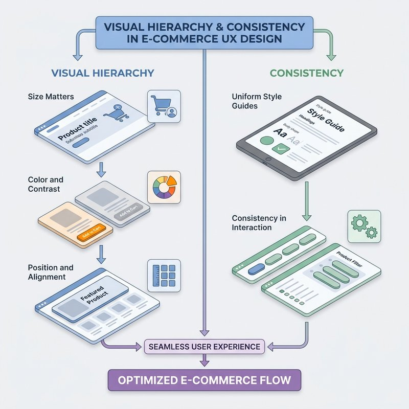
Visual hierarchy refers to the arrangement and presentation of visual elements that influence the perception of order and importance. It helps users navigate a page by directing their eyes toward essential content, ensuring they don't miss any significant details. This is accomplished using factors such as size, color, contrast, alignment, and spacing. In contrast, consistency ensures that design elements maintain uniformity across different pages and sections. It forms a familiar environment for users, allowing them to predict the layout and interactions, which enhances usability and reduces cognitive load.
By mastering these elements, you can guide users through your platform smoothly, enhancing their overall experience and encouraging them to interact more deeply with your products.
Digging Deeper: Principles of Visual Hierarchy and Consistency
Let's dive into how these principles work to transform a digital interface from chaotic to intuitive.
1. Principles of Visual Hierarchy
-
Size Matters: Larger elements naturally draw more attention. For example, a prominently featured product image is likely to catch the user's eye first.
-
Color and Contrast: Bright colors or high contrast can make elements stand out. Designers often use these techniques to highlight call-to-actions (CTAs).
-
Position and Alignment: Standard reading patterns (like the F-pattern or Z-pattern) guide how elements should be placed. Keeping important content aligned to these patterns ensures it gets noticed.
By considering these factors, you can structure your interface so that the user's gaze flows logically from one element to another, emphasizing what’s most important.
2. Ensuring Consistency
A consistent design helps users feel comfortable and reduces errors. Here's how you maintain it:
-
Uniform Style Guides: Creating a comprehensive style guide including fonts, colors, and button styles helps ensure that all pages and products have a unified look.
-
Repeatable Layout Patterns: Designers use grids and templates to keep layouts predictable. This predictability allows users to feel more in control and know what to expect.
-
Consistency in Interaction: Whether users are hovering over a button or filling out a form, responses should be uniform system-wide, promoting familiarity.
Both visual hierarchy and consistency work hand in hand to create a harmonious and user-friendly digital experience.
Real-World Applications in E-commerce
Now, let's examine some real-life applications of these principles in the e-commerce world.
Example 1: Product Page Design
Take the example of an online retail giant like Amazon. Its product pages are a great demonstration of visual hierarchy:
-
Primary Image: Large and placed at the top-left, aligning with natural reading patterns.
-
Product Name and Price: Bold and prominent right next to the image, making these critical details unmissable.
-
Buy Button: Contrasting color and large size to immediately draw the user towards purchasing.
When you visit a product page, these elements naturally direct your attention in a cascading order, facilitating a smoother decision-making process.
Example 2: Consistency in Navigation Bars
Consider a company like Etsy, known for its consistency. Whether you're on the homepage or a seller's page, the navigation bar remains consistent:
-
Placement: Always at the top, making it easily accessible.
-
Styling: Uniform colors and font styles across all pages.
-
Functionality: User interactions like dropdowns and hover effects are consistent, ensuring a predictable and reliable navigation experience.
This consistency enhances user confidence, as customers don’t have to relearn the interface with every visit.
Bringing It All Together for Enhanced Design
Incorporating visual hierarchy and consistency into your design not only improves aesthetics but significantly enhances user satisfaction and engagement. Consistent use of fonts, colors, and layouts invites users into a familiar space, making navigation intuitive. Meanwhile, a well-crafted visual hierarchy guides user attention effectively, ensuring that critical information doesn’t go unnoticed.
Key Takeaways:
-
Visual hierarchy helps prioritize information, reducing user frustration.
-
Consistency ensures a stable and intuitive user environment.
-
Practically applying these can dramatically enhance the overall user experience on an e-commerce platform.
Now that the foundation is in place, we'll move into Accessibility in UX Design. Applying these core concepts with an inclusive perspective ensures that your platform welcomes all users, including those with disabilities.