Why “color creating” shows up in analytics work

You finish a dashboard, and the numbers are right—but the meeting goes sideways. A leader points at the wrong line in a trend chart, a stakeholder can’t tell “good” from “bad,” and someone with a color-vision deficiency says the key categories all look the same. In data analytics, color is not decoration; it’s a communication channel that can either reduce thinking effort or quietly introduce errors.

Color creating is the deliberate process of choosing and applying color so your audience can see structure, meaning, and priorities in the data without needing extra explanation. This lesson consolidates the essential concepts you need to use color responsibly and consistently in common analytics artifacts like dashboards, reports, and exploratory visuals.


The core vocabulary: what you’re actually choosing

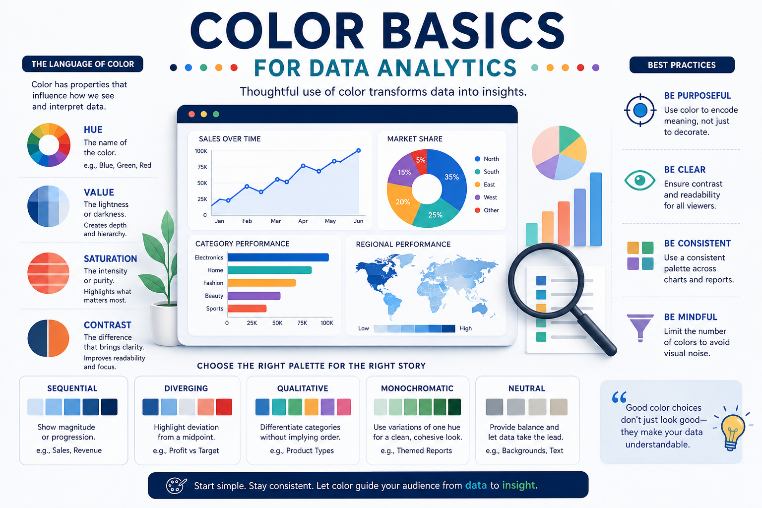
Color decisions become much easier when you separate what color is from what color does. Three foundational ideas keep beginners from mixing up aesthetics with meaning: hue, saturation, and lightness (often discussed as HSL/HSV thinking). Hue is the “family” (blue vs. orange), saturation is intensity (muted vs. vivid), and lightness is how bright/dark it appears. When you change these dimensions, you change how strongly a mark calls attention to itself, and how readable it stays under different viewing conditions (projectors, dark mode, print).

You also need to distinguish palette types by the relationship they represent. A categorical palette is for distinct groups with no inherent order (regions, product lines). A sequential palette is for ordered magnitude (low to high revenue), and it typically varies lightness smoothly to align with how people perceive “more.” A diverging palette is for values around a meaningful midpoint (variance from target, change from baseline), using two directions away from a neutral center so “above” and “below” feel symmetrical.

Finally, remember that color is only one encoding channel among others: position, length, shape, and text often carry meaning more precisely. A practical beginner rule is: use color to group, highlight, or signal direction, not to carry high-precision comparisons. If the audience must read exact differences, lean on axes, labels, and ordering first, then use color to support the story.


Three big ideas that make color choices work in practice

1) Match palette type to data meaning (not chart type)

A common beginner mistake is choosing a palette because it “looks good,” then retrofitting meaning afterward. Start with the data relationship: category, magnitude, or deviation. When the palette type matches the data, viewers can infer meaning without a legend hunt. When it doesn’t, people misread the chart even if they can technically decode it.

Categorical palettes work best when colors are equally prominent, because no category should feel “more important” unless you intend emphasis. That means avoiding a single neon color among muted ones unless that category is meant to stand out. It also means limiting the number of categories shown at once; as categories grow, colors become harder to distinguish, and the chart turns into a memorization task. If you must show many categories, consider grouping, small multiples, or using one accent color plus neutrals.

Sequential palettes are about perceived order, and perception relies heavily on lightness steps. If you use multiple hues in a sequential scale without careful control, viewers may interpret hue changes as category shifts rather than “more/less.” There’s also a subtle pitfall: a very saturated dark color can look “more” even if the numeric value is not, because it visually weighs more. Good sequential design keeps the steps monotonic in lightness so “higher” consistently looks stronger.

Diverging palettes are powerful but easy to misuse. They only make sense when there’s a real, interpretable midpoint: 0 change, target, average, budget, or baseline. Without that midpoint, you create an artificial “good/bad split” the data doesn’t support. Another frequent issue is unbalanced ranges (e.g., -2% to +40%), where one side dominates and the midpoint visually disappears. In those cases you often need either a capped range, a transformed scale, or a design that clearly labels the asymmetry.

2) Use a hierarchy: neutrals for structure, color for meaning

In analytics, most screens need to show structure (gridlines, axes, headers) and meaning (data marks, key callouts). If everything is colorful, nothing stands out. The most reusable idea for beginners is to create a color hierarchy where neutrals define the scaffolding and color is reserved for the data signal.

Neutrals (grays, near-blacks, near-whites) excel at “being there without shouting.” Use them for borders, gridlines, secondary labels, and background elements so the audience’s attention stays on the marks that represent data. This is not just aesthetics—it directly affects how quickly someone can locate what matters. When structural ink is too dark or too contrasty, it competes with the data and increases cognitive load.

Then decide where color earns its keep. A strong default is one primary accent used for what you want people to notice first (a selected series, the current period, a targeted KPI). Everything else can be a muted supporting palette. This also makes your visuals more consistent across a dashboard: users learn that the accent means “pay attention,” and they stop reinterpreting every tile from scratch.

Misconceptions show up here. Many beginners believe “more colors = more information.” In reality, you often get the opposite: more colors create more categories in the viewer’s mind, even when you didn’t intend categories. Another misconception is that color can replace labeling. Color can guide attention, but labels and ordering do the heavy lifting for clarity. Use color to reduce search time, not to force viewers to decode a rainbow.

3) Design for accessibility and real viewing conditions

Color creating for analytics isn’t finished when it looks good on your monitor. Dashboards are viewed on projectors, phones, printed PDFs, and in rooms with glare. On top of that, a meaningful portion of your audience may have color-vision deficiencies (commonly red-green confusion). If color is the only carrier of meaning, some users will lose the message entirely.

A practical approach is to ensure your color choices remain distinguishable through lightness contrast and not only hue difference. Two colors that are “different” as hues can collapse into the same shade when converted to grayscale or seen by someone with limited color discrimination. So, when categories must be differentiated, choose colors that also differ in lightness and saturation. When values encode magnitude, ensure the sequential ramp has clear lightness steps.

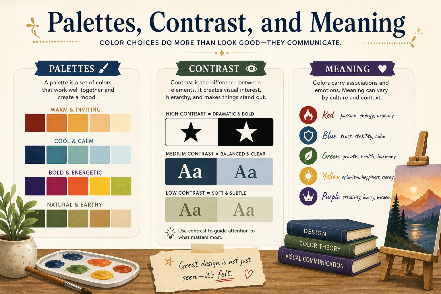
Also avoid “semantic traps” that vary by culture and context. Red often implies negative and green implies positive, but not every metric is inherently good or bad (e.g., “variance” might be good in one view and bad in another). If you use semantic colors, make the meaning explicit with labels, plus/minus signs, or annotations so interpretation is not left to guesswork.

The best-practice mindset here is redundancy: pair color with another cue whenever misinterpretation would be costly. That can be direct labels on critical points, arrows for direction, or distinct line styles when comparing only a few series. Redundancy makes your message survive real-world conditions—and it’s a hallmark of professional analytics communication.


Choosing the right palette quickly (and what can go wrong)

Here’s a compact comparison you can use to sanity-check your intent before you pick colors.

| Dimension | Categorical (Qualitative) | Sequential | Diverging | |---|---|---| | Best for | Groups without order (channels, regions, product types). | Ordered magnitude (low → high conversion rate). | Deviation around a midpoint (below/above target, negative/positive change). | | What should change visually | Hue differences with similar prominence; avoid one “loud” color unless highlighting. | Mostly lightness (and sometimes saturation) increasing/decreasing smoothly. | Two sequential ramps moving away from a neutral center. | | Common pitfall | Too many categories; colors become indistinguishable and feel arbitrary. | Hue shifts imply category changes; dark/saturated colors overweight perception. | Using it when no true midpoint exists; or unbalanced ranges hide the center. | | Beginner-safe best practice | Limit categories; use neutrals for non-focus groups; keep legend consistent across pages. | Use a single-hue ramp with clear lightness steps; label endpoints when needed. | Reserve for “difference from X”; choose equal perceptual weight on both sides. |


Applied example 1: A KPI dashboard with “good/bad” signals

Imagine a KPI dashboard tile showing Monthly Revenue vs Target, plus a small bar chart of the last 12 months. Color creating starts by deciding what question the viewer asks first: “Are we on track?” That implies a deviation framing, so a diverging approach is tempting—but only if you truly have a meaningful center: Target = 0 variance.

Step-by-step, you can set hierarchy first. Make the tile background neutral, axis labels and gridlines light gray, and the bars a muted neutral. Then reserve one accent for the current month. Now introduce meaning: if variance is the main message, color the current month bar using a diverging scheme where values below target are one direction (e.g., toward a cooler/darker tone) and above target are the other direction (toward a warmer/darker tone), with near-target values close to neutral. Add a text label “+3.2% vs target” or “-1.1% vs target” so color isn’t carrying the full burden.

The impact is speed: a leader glances and knows direction immediately, while the label provides precision. The limitation is that diverging color can imply emotion (“bad red”) even when context is nuanced (e.g., overspending might be “bad,” but underutilization might also be “bad”). When the metric’s implication changes by context, choose a diverging palette that’s less semantically loaded and anchor meaning with explicit wording like “above/below target” rather than “good/bad.” This keeps the dashboard truthful while still being fast to read.


Applied example 2: Segment comparisons in a cohort retention chart

Consider a retention chart comparing four customer segments over 12 weeks. The data is categorical (segment names) and you’re comparing shapes of lines over time. The color goal is not “more/less” but “which line is which,” plus possibly “which one should you focus on.” That calls for a categorical palette with good separation and stable interpretation.

Start by selecting four hues that remain distinct even when lines overlap. Keep line thickness moderate, and use neutrals for axes and gridlines. If one segment is strategically important (e.g., “Enterprise”), use a slightly stronger saturation for that segment and mute the others. Then support color with redundancy: direct-label the line ends with segment names so viewers don’t bounce between legend and plot. If the chart might be printed, ensure at least one non-color cue is present, such as a distinct line style for the highlighted segment.

The benefit is that stakeholders can track each segment reliably across time, and the highlight communicates priority without drowning out the rest. The limitation is scalability: if segments increase from 4 to 12, categorical color breaks down quickly. At that point, color creating becomes an editorial decision—aggregate segments, use small multiples, or show only the top few with an “Other” group—because no palette can make 12 overlapping lines easy to decode. In analytics, good color choices often go hand-in-hand with good scope choices.


The essentials to carry forward

Color creating for data analytics is a small set of repeatable decisions:

  • Pick a palette type that matches the data relationship: categorical, sequential, or diverging.

  • Build a visual hierarchy: neutrals for structure, color for meaning and attention.

  • Design beyond your screen: rely on lightness contrast, avoid color-only encodings, and add redundant cues for critical interpretations.

  • Treat color as communication, not decoration: the best color is the one that prevents misreads and speeds up understanding.

This sets you up perfectly for Apply a Color Checklist [25 minutes].

Last modified: Monday, 13 July 2026, 4:17 PM