

Section outline
-
Introduction
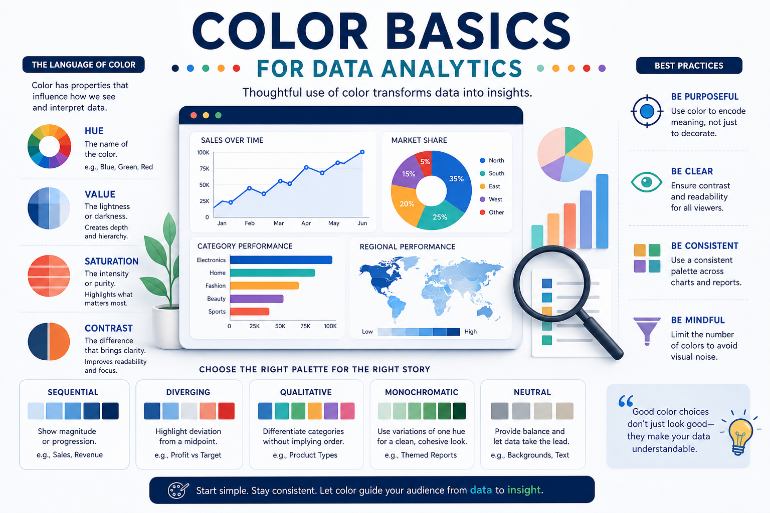
Color is one of the fastest ways to guide attention and clarify meaning in charts and dashboards, but it can also mislead when used inconsistently. In this section, you’ll learn what “creating color” means in analytics work: choosing, combining, and controlling color to support quick, accurate interpretation. You’ll also build a foundation in core color attributes and common screen-first color models used to specify colors reliably.
Learning Objectives
-
Define “creating color” for analytics as deliberate choices that improve clarity in charts and dashboards.
-
Explain how hue, saturation, and value affect emphasis, readability, and visual hierarchy in data displays.
-
Identify and apply common color models (RGB, HEX, and CMYK awareness) in a screen-first analytics context.
-
-
Introduction
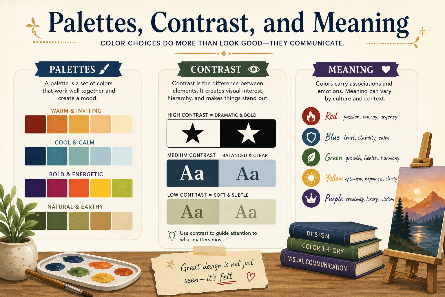
Effective color choices in analytics turn complex charts into fast, reliable insights. This section focuses on selecting the right palette type, building clear contrast and visual hierarchy, and applying color meaning responsibly in business contexts. You’ll also learn accessibility essentials so dashboards remain interpretable for more viewers and consistent across teams.
Learning Objectives
-
Choose appropriate categorical, sequential, or diverging palettes based on the data story and chart type.
-
Apply contrast and hierarchy techniques to improve readability and focus attention on key values.
-
Use color meaning, accessibility principles, and consistency rules to create trustworthy analytics outputs.
-
-

Introduction
This section consolidates the core color concepts from earlier sections so you can apply them confidently in real data analytics work. You’ll recap the essentials of palettes, contrast, meaning, and accessibility, then connect them to practical chart and dashboard decisions. The focus is on remembering what matters most for clear, trustworthy “at-a-glance” communication.
Learning Objectives
-
Summarize the key color principles needed for clear analytics visuals.
-
Evaluate a simple chart or dashboard for common color-related issues and improvements.
-
Identify next-step topics to continue building color skills for data communication.
-