Meaning, Accessibility, Consistency
When color starts arguing with your numbers
You publish a dashboard showing churn, revenue by product line, and ticket resolution time. The data is right, the calculations are right, and the layout is clean—yet stakeholders still walk away with conflicting interpretations. One person says churn “spiked,” another thinks a product line “collapsed,” and an ops lead flags a queue that isn’t actually breaching SLA. Often, the problem isn’t the metric. It’s that color is carrying unintended meaning, or excluding part of the audience, or shifting from chart to chart.
In the last lesson, you learned to control attention with contrast and hierarchy—using lightness, saturation, and hue to decide what gets seen first. That foundation matters here, because “what gets seen first” becomes dangerous when the color means the wrong thing, can’t be reliably perceived, or changes identity across views. This lesson tightens your system in three ways:
-
Meaning: the story color implies (good/bad, increasing/decreasing, group identity).
-
Accessibility: whether the encoding still works for all viewers and environments.
-
Consistency: whether the same color reliably stands for the same thing across a dashboard.
Three pillars: meaning, accessibility, consistency
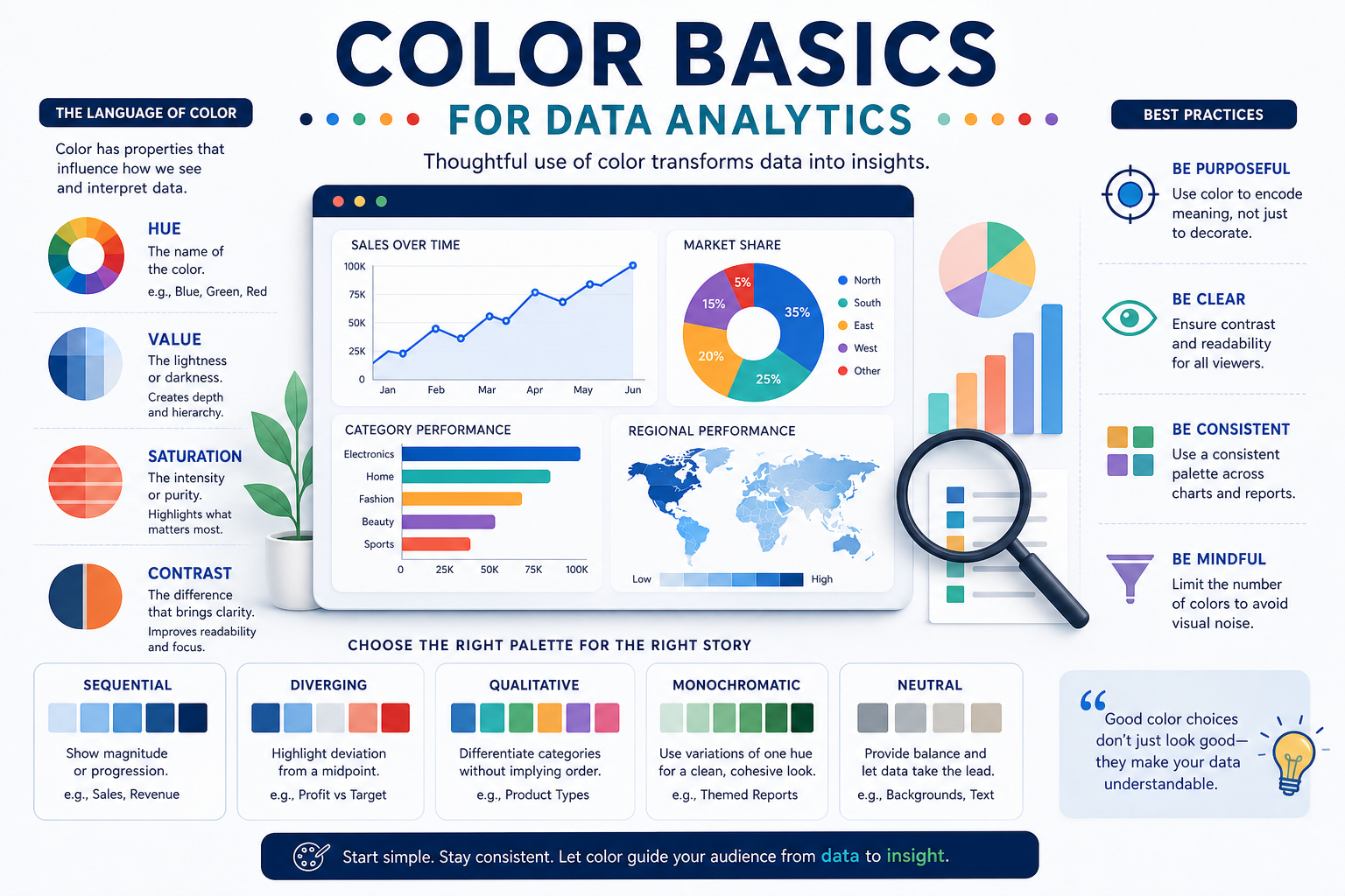
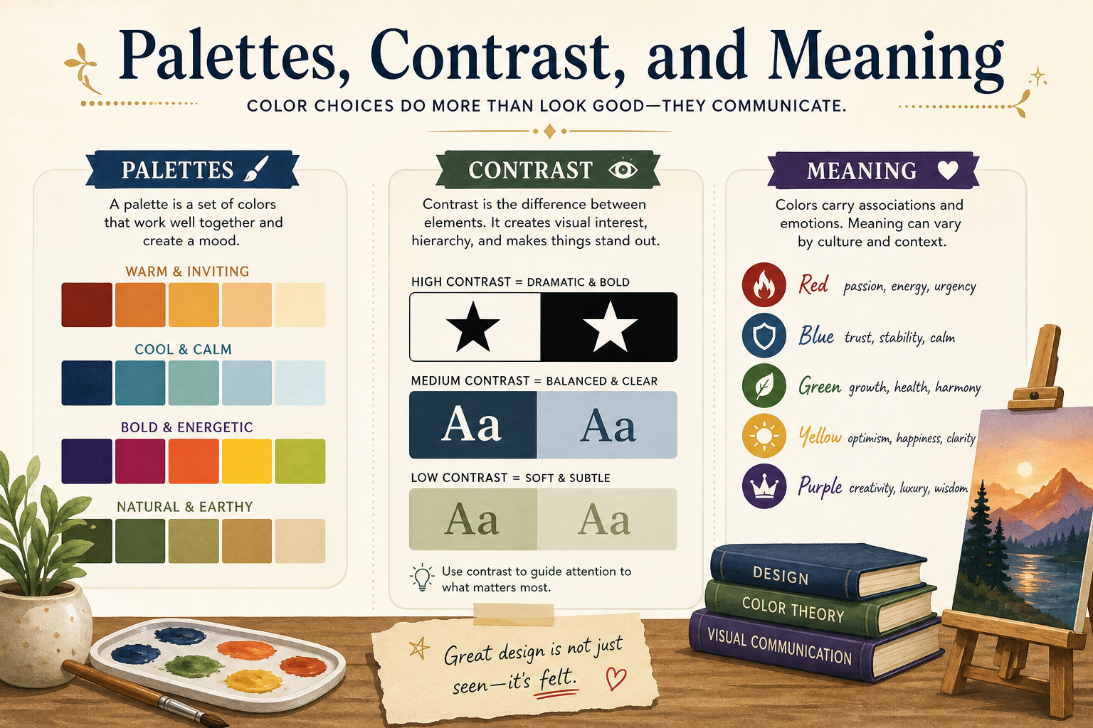
Meaning (semantic color use) is the relationship between a color choice and what viewers infer from it. In analytics, color is never neutral: red implies alert; green implies success; darker often implies “more.” Meaning is strongest when you align it with the analytical task: categorical colors for distinct groups, sequential ramps for ordered magnitude, diverging palettes around a meaningful midpoint, and accent color for intentional focus.
Accessibility is whether the chart remains interpretable across viewers and conditions—especially for people with color-vision deficiencies, low-contrast displays, projectors, printouts, and small screens. A key principle from the prior lesson still applies: lightness contrast survives when hue fails. So accessibility is not only about “different hues,” but about whether the encoding is still readable when hue differences collapse.
Consistency is the discipline of stable mapping: “Email is always purple,” “above SLA is always the same side of the diverging scale,” and “highlight always uses a single accent color.” Consistency reduces legend hunting and cognitive load, and it protects trust—because viewers don’t have to re-learn the visual language every time they open the dashboard.
A helpful analogy: if your dashboard is a language, meaning is vocabulary, accessibility is whether the words are legible to all readers, and consistency is using the same words to mean the same things every time.
Meaning: make color say what you intend (and nothing you don’t)
Color carries meaning through two channels at once: data meaning (what the scale encodes) and cultural meaning (what the hue implies). When those two collide, viewers infer intent you didn’t have. This is why “use red as a default highlight” backfires: it creates emphasis (high saturation) and alarm semantics (red) simultaneously. If you reserve red for actual exceptions or SLA breaches, red becomes reliably interpretable; if you use it as a decorative accent, it becomes noise that trains people to overreact.
Meaning also depends on the palette type matching the analytical question, not the chart type. If the question is “how high is resolution time?” a sequential light-to-dark ramp makes darker cells read as “more/longer,” which matches the human tendency to interpret stronger lightness as greater magnitude. If the question is “are we above or below the SLA threshold?” you need a diverging palette centered at the threshold, because the midpoint is the meaning. Without a neutral midpoint, near-threshold values can look dramatic, and stakeholders will treat “close to 24 hours” as if it’s a clear breach.
A common misconception is that “more colors communicate more nuance.” In practice, multi-hue gradients (especially rainbow/spectral) invent structure that isn’t in the data: yellow often looks “stronger” than blue at the same numeric value, and artificial hue boundaries read like categorical breaks. Another pitfall is mixing semantic hues casually for neutral categories—using red/green for product lines, for example—because the audience will spontaneously map “bad/good” even when the categories are just identities.
Best practices rooted in the contrast/hierarchy foundation:
-
Use lightness to communicate magnitude whenever possible; use hue primarily for identity.
-
Reserve semantic colors (red/green) for true directional meaning (risk/success), not arbitrary groups.
-
Treat saturation as emphasis, not information: one vivid accent can be powerful; many vivid marks create accidental “importance rankings.”
Accessibility: design so the message survives imperfect viewing
Accessibility is not a “nice-to-have” in analytics. If a chart can’t be read in a weekly meeting on a washed-out projector, it might as well be wrong. The biggest accessibility trap is relying on hue difference alone, especially in small marks like thin lines, legend chips, or dense scatterplots. Under compression, hues converge; under poor lighting, subtle differences disappear. That’s why the previous lesson’s guidance—lightness contrast is the most robust lever—is your best accessibility tool.
Color-vision deficiencies (commonly red–green confusion, but not limited to it) amplify this problem. If your only distinction between “above SLA” and “below SLA” is red vs. green at similar lightness, a portion of your audience will struggle or fail entirely. The fix is not “pick different colors” as a slogan; the fix is to ensure distinct lightness and/or structure. For example, in a diverging palette, keep the midpoint neutral, and make the “breach” side both more saturated and darker so it still reads as more urgent when hue is unreliable.
Accessibility also includes non-color cues and redundancy. You don’t need to turn every chart into a patterned mess, but you should avoid single points of failure. If a line chart has multiple series, consider direct labels for the key series, slightly different line thickness for the focus series, or markers on highlighted points. This connects directly to hierarchy: you’re not just helping accessibility—you’re also making the reading order clearer.
Common pitfalls to watch for:
-
Low-contrast gray-on-white scaffolding that becomes unreadable: gridlines should be low-contrast, but axis labels still must be legible.
-
Using yellow or very light tones as “equal” categorical colors: they often vanish on light backgrounds and appear less important.
-
Encoding two ideas with the same color dimension: for instance, using saturation to mean both “channel identity” and “priority” creates confusion.
A practical accessibility check that aligns with the last lesson: if you take a screenshot and view it small (or squint/blur), you should still see the message via lightness and hierarchy—not only via hue.
Consistency: prevent “palette drift” across a dashboard
Consistency is where good dashboard teams quietly outperform everyone else. If “Paid Search” is blue in one chart and teal in another, viewers spend attention on translation instead of insight—and worse, they may assume the data changed because the color changed. Consistency is not about making everything identical; it’s about making the mapping rules stable so the dashboard feels like one coherent system.
Consistency has three layers. First is identity consistency: categorical mappings stay fixed across panels (Email is always purple, Organic is always green, etc.). Second is scale consistency: sequential or diverging ramps keep the same directionality and endpoints (darker = more; midpoint = SLA). Third is hierarchy consistency: when you highlight something, you do it the same way every time (a single accent color, while other marks mute). This is directly connected to the prior lesson’s idea of treating saturation as a “scarce resource.” If your highlight treatment changes from chart to chart—sometimes red, sometimes orange, sometimes bold outlines—people don’t learn your visual language, and the “what matters most” signal weakens.
A typical misconception is that consistency reduces flexibility. The opposite is usually true: when the base rules are stable, you can create focus quickly (accent hierarchy) without re-teaching the viewer each week. The most common pitfall is “local optimization”—a designer tweaks colors to make one chart look good, unintentionally breaking cross-dashboard meaning. Another pitfall is inconsistency around diverging midpoints: if one heatmap centers at 0% variance and another centers at 24 hours, but both use similar hues, viewers may misread direction or urgency.
Use this kind of decision rule: change colors only when the meaning changes (different variable, different task, different midpoint). If the meaning is the same, keep color stable and adjust hierarchy using lightness and saturation rather than swapping hues.
A quick comparison: what each pillar protects you from
| Dimension | Meaning | Accessibility | Consistency |
|---|---|---|---|
| Main goal | Color implies the right story (good/bad, more/less, above/below). | Everyone can decode the chart across vision types and environments. | Viewers don’t have to re-learn the mapping each time. |
| Primary tools | Palette type fit (categorical/sequential/diverging/accent), semantic hues, midpoints. | Lightness contrast, redundant cues (labels/thickness), avoiding hue-only encoding. | Stable categorical mapping, stable scale direction/endpoints, stable highlight rules. |
| Most common failure | Unintended semantics (red means alarm when you only meant “focus”). | Differences vanish on projectors/small marks or for color-blind viewers. | “Palette drift” makes categories and signals feel inconsistent across charts. |
| Trust impact | Viewers infer intent you didn’t have; decisions skew emotionally. | Some viewers can’t verify the story; errors go unnoticed or get contested. | People doubt whether changes are real or visual; adoption drops. |
Example 1: Marketing channel dashboard (identity + meaning + accessible focus)
A typical channel dashboard includes sessions, conversion rate, and CAC across Paid Search, Organic, Email, Social, and Affiliates. The palette type is categorical because channels are distinct groups, and earlier guidance says to keep categorical hues similar in lightness/saturation so no channel looks “more important” by accident. Now add today’s challenge: leadership wants the weekly view to answer, “What changed in Paid Search efficiency?”
Step-by-step application:
- Lock identity mapping across the whole dashboard (e.g., Paid Search always blue, Email always purple). This is consistency at the category layer, and it prevents legend re-learning.
- Avoid semantic traps: don’t choose red for a channel unless you truly want “alert” semantics attached to that channel everywhere. If Paid Search is the focus, keep it in its identity hue; create emphasis through saturation and lightness rather than switching to a warning color.
- Apply an accent hierarchy without breaking meaning: make Paid Search the only saturated, higher-contrast series, while rendering other channels as muted grays or low-saturation versions of their hues. This preserves categorical meaning while controlling attention, aligning with the prior lesson’s principle that “everything highlighted = nothing highlighted.”
- Make it accessible: ensure that the emphasized series is not only a different hue but also noticeably different in lightness and/or thickness. If someone can’t distinguish the hues well, they should still see the focus series immediately.
Impact, benefits, limitations:
-
Benefit: stakeholders converge on the same reading order (focus channel first, context second), reducing meeting time spent arguing about what the chart “shows.”
-
Benefit: identity remains stable week-to-week, so trend interpretation is faster and trust increases.
-
Limitation: if multiple channels are equally critical, a single accent approach collapses. You may need multiple small charts or rotate the focus rather than trying to highlight three “most important” things at once.
In real workflows, this becomes a standard: stable channel colors across all tabs, plus a consistent “highlight rule” for whichever question the meeting is answering.
Example 2: Ops monitoring for resolution time (sequential vs diverging without misleading urgency)
An ops team monitors ticket resolution time by queue and day, and they also track variance to an SLA of 24 hours. This is exactly where meaning, accessibility, and consistency can make or break a dashboard. If you show resolution time with a multi-hue rainbow heatmap, you create false boundaries that look like operational thresholds—even when they’re just color transitions. If you show SLA variance with red/green of similar lightness, you risk excluding viewers and miscommunicating severity.
Step-by-step application across two related views:
- For “how long does it take?” use a sequential light-to-dark ramp. Light cells represent fast resolution; dark cells represent slow resolution. This matches perceptual expectation: darker feels heavier and therefore “more,” and it remains readable on low-quality displays because lightness contrast is doing the work.
- For “are we above or below 24 hours?” use a diverging palette centered on 24 hours (or on 0 hours variance, if you compute variance explicitly). The midpoint must be visually neutral so “on target” reads calm rather than alarming.
- Make “breach risk” the more insistent side through hierarchy: higher contrast (often darker) on the above-SLA side, while below-SLA remains visible but less urgent. This is not bias; it’s aligning visual urgency with operational priority.
- Enforce consistency of direction: if “above SLA” is always the same side/hue family (e.g., warm tones) across every ops panel, teams learn the signal instantly and make fewer interpretation errors.
Impact, benefits, limitations:
-
Benefit: sequential supports scanning for hotspots; diverging supports scanning for threshold breaches. Each answers a different question cleanly.
-
Benefit: the neutral midpoint prevents “near target” from looking dramatic, reducing unnecessary firefighting.
-
Limitation: if SLA differs by queue, a single shared midpoint can mislead. In that case, you need separate panels or normalization so the midpoint still means the same thing everywhere.
In organizational terms, this improves decision velocity: the visualization becomes a reliable alerting surface, not a source of debate about what colors “mean today.”
Make color reliable: a closing checklist you’ll actually use
Color choices become trustworthy when meaning, accessibility, and consistency reinforce each other.
-
Meaning: match palette type to the analytical task (categorical identity, sequential magnitude, diverging around a midpoint, accent for focus) and avoid accidental semantics (like using red just to “stand out”).
-
Accessibility: don’t rely on hue alone; use lightness contrast and selective redundancy (labels/thickness) so the message survives projectors, small screens, and color-vision differences.
-
Consistency: keep stable mappings and stable highlight rules so viewers build a mental model once and reuse it everywhere.
A simple system to reuse
-
Color isn’t decoration in analytics; it’s a language that can clarify or distort.
-
Contrast and hierarchy control attention, and meaning/accessibility/consistency control interpretation and trust.
-
A good dashboard feels “obvious” not because it’s flashy, but because its color logic stays stable, inclusive, and aligned with the question being asked.