

Sectieoverzicht
-
Introduction
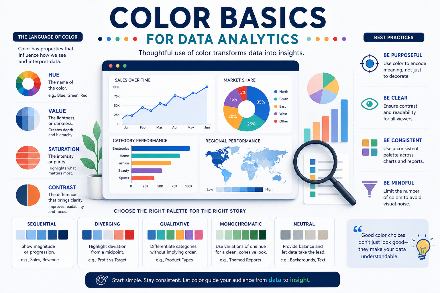
Color is one of the fastest ways to guide attention and clarify meaning in charts and dashboards, but it can also mislead when used inconsistently. In this section, you’ll learn what “creating color” means in analytics work: choosing, combining, and controlling color to support quick, accurate interpretation. You’ll also build a foundation in core color attributes and common screen-first color models used to specify colors reliably.
Learning Objectives
-
Define “creating color” for analytics as deliberate choices that improve clarity in charts and dashboards.
-
Explain how hue, saturation, and value affect emphasis, readability, and visual hierarchy in data displays.
-
Identify and apply common color models (RGB, HEX, and CMYK awareness) in a screen-first analytics context.
-